Building better backend CMS experiences
Let's face it, between self-imposed deadlines, bug fixes, and customer change requests, there never seems to be enough time in the day to get things done. As a developer with some background in design and UX, I have seen my fair share of horrible interfaces and difficult if not impossible to use CMS’s. I've made it my job to build CMS backend interfaces that are not only easy to use but easy to understand, especially when it comes to our favorite CMS, Wordpress. Today I'll be sharing a few things I've learned along the way and hopefully help you understand how to build a better backend for your websites.
Let's start with the basics
What is a CMS (Content Management System)?
Consider this analogy, if the frontend (what the end-user sees and interacts with of your website ) is your body then the backend is the brain. It is essentially the part of your website that controls nearly every aspect of how things function. Without a CMS, it would be difficult for a non-web savvy user to update and operate their website effectively. On the same token, a poorly designed CMS experience could be just as devastating for a number of reasons.
Aside from simply needing a website refresh, a horrible CMS experience seems to be the #1 reason clients want out of their existing sites. We've all heard the Joomla, Drupal and even Wordpress horror stories. I'm sure these CMS's are great in their own right and are not fundamentally at fault for the bad experiences most customers who come to us seem to have. Below I will go over a few tips on what you can do to ensure a good user experience for your backend no matter what CMS you choose.
If you can't explain it simply, you don't understand it well enough.
How can we make Wordpress, Drupal, Craft, BigCommerce, etc. better?
If you can't explain it simply, you don't understand it well enough.
In order to build a better UX, it's crucial that you understand all of the working parts of your site or application. If you have to second guess about a field that appears on the backend of a site then your users will too, it's as simple as that. In most cases, I believe that a website's backend should reflect the editable parts of the frontend as much as possible and provide clear instructions on how to access and edit a block of content. You must be able to communicate to your users as if you were having a conversation with them. Most developers tend to look at things through their own lens, not as their client, the end-user.
Look, I get it, sometimes we tend to blame the end-user for being too "inexperienced" and just not wanting to do any work to learn the ins and outs of how to manage their own website. To us, these things seem easy and intuitive but it's important to step back and ensure that everyone understands what you've built, not just you. When a user stops using what you've built because it's too hard to use then you've failed, and ultimately they look elsewhere and you won't have a second chance to make a first impression.
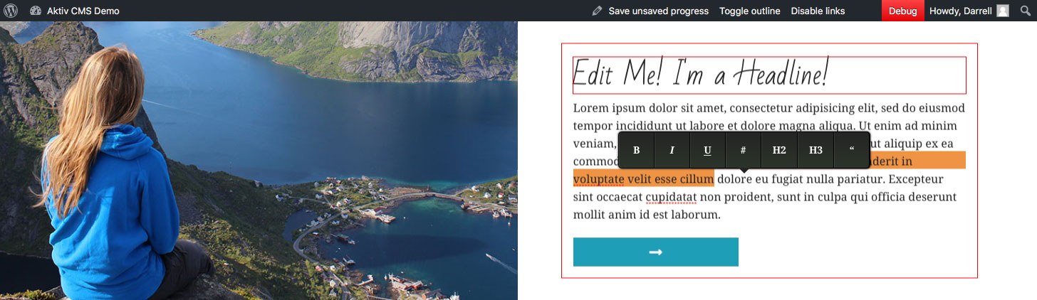
Use all of the tools at your disposal
CMS's have come a long way over the years and many now offer inline editing capabilities that bridge the gap between frontend and backend. CMS's like Craft and Wordpress do this extremely well and have set the standard for what is expected and clients love these types of tools. Implementation of these sort of features is fairly straight-forward and they do a lot for a customer confidence.
So what are some actions that you can take the help you get started? Below are a few tips that will help you effectively organize your backend for better UX:
- Order Sections
- Order sections as they appear on the frontend.
- Field Grouping
- Group similar fields in the correct order.
- Field Types
- Use the correct field-type for each content type.
- Globals
- Group global site wide options on their own page (Footers, Social Links, etc.)
- Field Descriptions
- Add descriptions on fields that clearly explain what they do. For image or gallery fields it's always helpful to include image dimensions.
- File Sizes
- Restrict file sizes for certain file types. We've all seen the 20MB .jpeg the client uploaded to their homepage then proceeding to contact you when the site is too slow.
- Organize Sections
- Use tabbed sections for pages with lots of content. Landing pages usually fall into this category since they generally provide overviews for all of the sections within.
- Build something that you would actually want to use.
- And use it.
Conclusion
It's easy to not care and just put out a sub-par product because, after all, 99.9% of the people using the site won't see the work you did, right? Wrong. Your customer's aren't the end users of the website, they are the people who hired you to build it and by following some of the steps in this article you could go a long way in ensuring they are happy with what you've built . If you want to see what a great backend user experience looks like then contact us here a Aktiv and we will schedule live Wordpress CMS demo for you and your team.