Setting the mood with a Mood Board
In almost every other industry a professional designer starts with a mood board in some capacity. An architectural designer will create a presentation board to communicate the key elements in their design. An interior designer will create a mood board and design schematic to communicate ideas and products involved. Advertisers use mood boards to establish a vision or approach to an advertising or marketing concept before the designer starts working on the actual ad layout.
Some Background
effectively communicate your design ideas to your client
As a website designer you should be doing your due diligence to understand the purpose of the project, who the end-users are, parameters and requirements, budgetary restrictions, and the customer's desires before beginning your design. However, many designers just perform a quick review of competitor websites, review company brand guidelines, and then begin a website design based on what they think is going to “wow” the client. This “shotgun” approach used for years in the web design industry has led to clients expecting spec designs and multiple versions of a homepage. I'll admit this sometimes works, even a blind squirrel gets a nut now and then; but more often than not, it results in a disconnect with your clients vision, and a lot of extra iterative work.
It’s understandable, as the web design industry when compared with other design fields is just in it’s infancy. Most web designers from the past 15-25 years have been self-taught since there were relatively few formal training options unlike other established design industries. So, if you are a client looking to hire a web agency or a web designer looking to be more effective, before jumping straight into composition design, let’s all get on board with a mood board!
Why is a Mood Board Important for Website Design?
Simply put, a mood board is an organized display of thoughts and ideas for your web design project. This will be a useful tool you can use to effectively communicate your design ideas to your client, gather feedback, and ensure everyone is on the same “page” for the sites mood, tone, and style before design begins. For example, I once had a client who thought I was crazy when I presented a homepage composition with a blue background, they told me they wanted “whitespace”, and the background wasn’t white. The following are a few example items you might want to include.
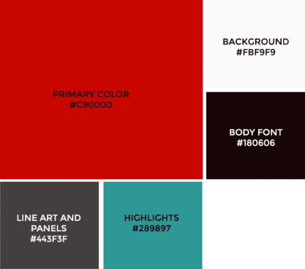
Color Palette
If the client already has a brand standards document, this is an easy one. You want to include their palette so you end up with a cohesive brand strategy. If they don’t have one, you’ll want to choose a palette based off either existing collateral and interviews. This is a good time to talk about a brand “refresh”. A company logo is the first place to start, it is the brands cornerstone and you do not want to use colors that clash with it. For websites I generally like to have a primary color, a highlight color and a few neutrals for background colors. Typically the simpler the better. Using a tool like Adobe Kuler and Paletton will allow you to browse color palettes that work well together, or choose a primary color and find complimentary colors.
To better communicate your vision, include notes for how you indent to use each color, like background color, headline color, font color, button and link color, etc.
Photography
A picture says 1000 words right? I know one thing for sure, photography can make or break a design, and coming to an agreement on the photography from tone, concept, composition and theme will really help make the design a success. For the mood board you can include visual metaphors, the lifestyle and/or personas the site should appeal to, and the types of images that you intend to use. I also like to include samples of “hero” imagery, possibly from other sites that may be creatively similar to your vision, a great hero photograph will create an emotional response.

Graphics and Icons
These are typically overlooked, but you should include a few samples of illustration styles you would like to use. Is the project loose and fun with a cartoonish style, business-like with clean lines and angles, or modern with minimalist features? If you are designing your own icons and have the budget, you would want to include a sample of the style, and be sure you can repeat it throughout the site. You may also want to include samples of infographics, tabular data, buttons, callouts styles and other graphical design patterns.
Also, while flat-design is very popular now, using subtle textures or background patterns works well, if you intend to use them, include some samples.
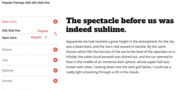
Typography
Again if the client already has a brand standards or graphical requirements doc go with that. However, most clients do not realize that their print font is either unavailable or going to cost monthly fees for a web use license. In most cases you're going to want to choose royalty-free web fonts that are similar to their brands fonts. Ideally start with the logo and choose fonts that compliment it. For your mood board show your headline fonts, body fonts and any other special type treatments. Just like colors a font pairings should be complementary to each other, choosing pairings from serif to sans-serif, display and script fonts. Display fonts can work well for larger sized headings, but generally do not have variants and weights for other purposes. Fonts have personalities, and choosing ones that match the overall style of your site is a matter of finesse. Sites like Typewolf can help with choosing font pairings, these guys are fontophiles.
Widgets and Features
This is the last thing I like to include, and it’s highly dependent on your project. Cutting and pasting elements from other websites that you think would work well in your GUI design. This is a great way to know what design features the client will want to include, and this is a good way to nail down what it is they liked and the desired style, maybe it was a carousel, tabs, or a news feature. Of course this depends on a lot of factors, user experience, usability and available content.

Putting it together
How you “construct” the mood board is entirely up to you and your situation. In the past for face to face meetings I used to adhere “copy and paste” to a gatorboard, and this is still a very stylish presentation, but also takes a lot of time, and impossible to iterate on. I’ve put these together in Photoshop, Illustrator, Indesign etc. and output to PDF’s. But gathering feedback can be difficult passing documents back and forth via email. These days an online tool will make life much easier, whether it’s a Google Doc or a dedicated collaborative tool, you will have the ability to comment and collaborate much easier.
Conclusion
To really be effective, write notes and actually present the moodboard with the stakeholders, press for questions, feedback and written comments after the presentation. This will give you a great blueprint for moving forward into composition design. If you have a larger project you may want to consider creating a style tiles document, similar to a interior designers design schematic and creating a printable style guide. All of these will help everyone on the project move forward as a reference (your client, other designers, UX team, and developers). Most of all you will have saved future time and set the mood of the project going forward, for a happy client that you executed the vision for the project. Learn more about our web design services.